Visualizing Drawdown
Drawdown measures the decline of a time series variable from a historical peak. I explore visualizing and computing drawdown-based metrics.
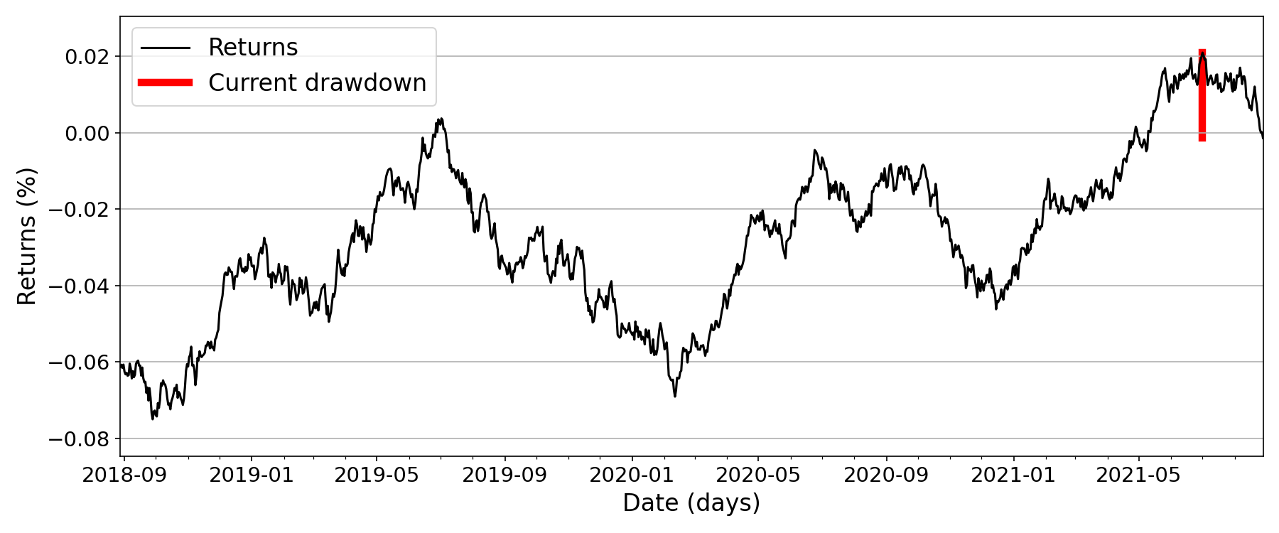
In finance or economics, drawdown is a measure of the decline of a variable, say a stock’s return or a portfolio’s performance, from some historical peak. For example, Figure is a time series of portfolio or strategy returns as a percentage, and the red line indicates the current drawdown.
I have found that visualizing drawdowns a particular way is helpful for having the right intuition to compute various drawndown-related metrics.
High water mark
Imagine that our time series gets “flooded” in the sense that any trough gets filled with water if it drops below its current peak or high water mark. The trough is always full to the brim on its left edge, since we are working with time series data (Figure ). The drawdown at any particular time point is simply the distance from the current variable value to the “surface of the water” or the high water mark at that time point.
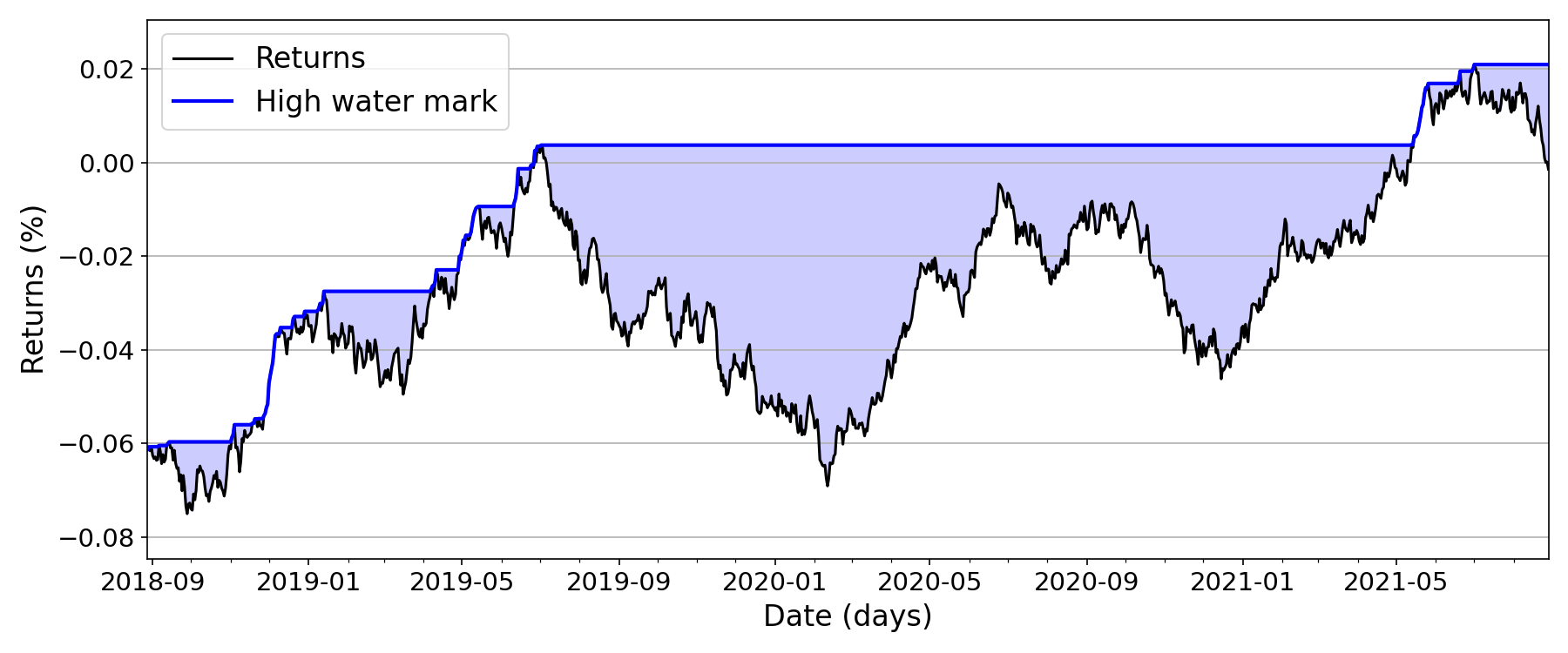
This immediately suggests a fairly simple way to compute the drawdown for all time points:
np.maximum.accumulate(x) - x
That’s it. We accumulate the maximum value so far to compute the high water mark, and the drawdown at each time point is simply the delta at that time point.
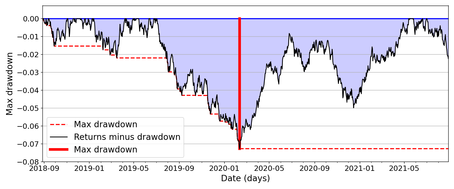
Deepest lake
To compute the maximum drawdown, we can accumulate the drawdown so far:
np.maximum.accumulate(
    np.maximum.accumulate(x) - x
)
We can visualize this by imagining that all the “lakes” in Figure are at the same elevation. Then the maximum drawdown is the deepest lake (Figure ).
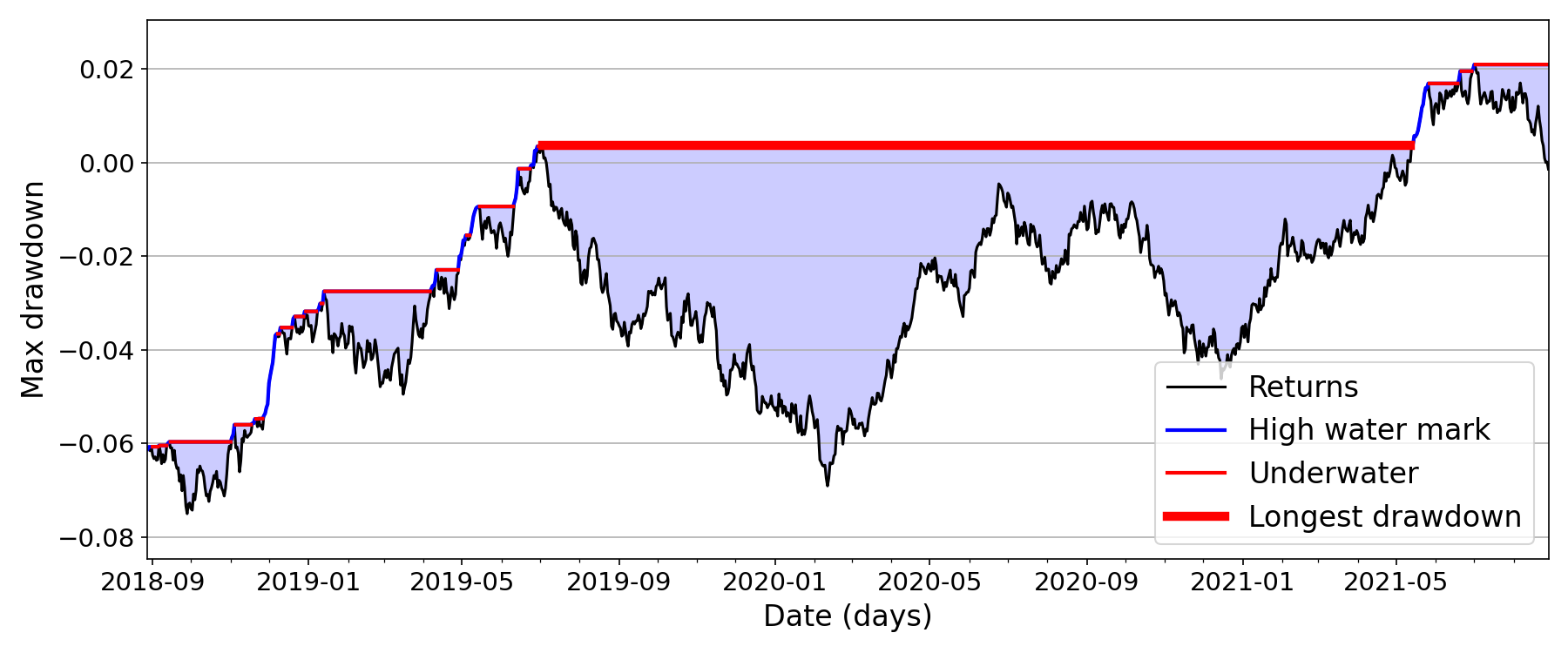
Widest lake
Finally, computing the longest drawdown in duration, which is typically defined as the longest (worst) amount of time the variable of interest is lower than the historical peak, i.e. it is simply the “widest lake”. And the widest lake is simply the longest duration that the time series has been underwater (Figure ).
We can compute this by generating a logical array of time points that represent when the series x is “underwater”, and then calculating the longest sequence of True values:
uwater  = (x - cummax(x)) < 0
runs    = (~uwater).cumsum()[uwater]
max_dur = runs.value_counts(sort=True).iloc[0]
The above snippet is based on this StackOverflow answer. If we want to compute the start and end dates, we can do the following:
def calc_longest_drawdown(x):
    uwater  = (x - cummax(x)) < 0
    runs    = (~uwater).cumsum()[uwater]
    counts  = runs.value_counts(sort=True).iloc[:1]
    max_dur = counts.iloc[0]
    inds    = runs == counts.index[0]
    inds    = (inds).where(inds)
    start   = inds.first_valid_index()
    end     = inds.last_valid_index()
    return max_dur, start, end
This allows us to visualize the longest drawdown as a sanity check, as in Figure . Note that the above two snippets assume that x is a Pandas pd.Series with dates as an index.
Conclusion
For me, visualizing drawdown in this way has made it more intuitive to compute drawdown-based metrics. Every time a time series dips, it immediately forms a “lake”, and the drawdown is just the depth of the lake. The maximum drawdown is the deepest lake formed so far, and the longest drawdown is the widest lake so far.